Colophon
“If I have seen further, it is by standing on the shoulders of giants”
Web Standards
This site strongly adheres to the philosophy of progressive enhancement and graceful degradation, meaning it will display all the bells and whistles for modern browsers, but still function and look good for older browsers (including those without script or CSS). The only way forward is to respect the hard learned lessons of the past and keep semantic content and style separate. Everyone wins in a flexible web that allows for future growth in new specifications without rendering older site's obsolete.
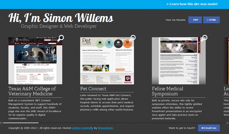
Screenshot of what this site looks like in older browsers with lesser feature support
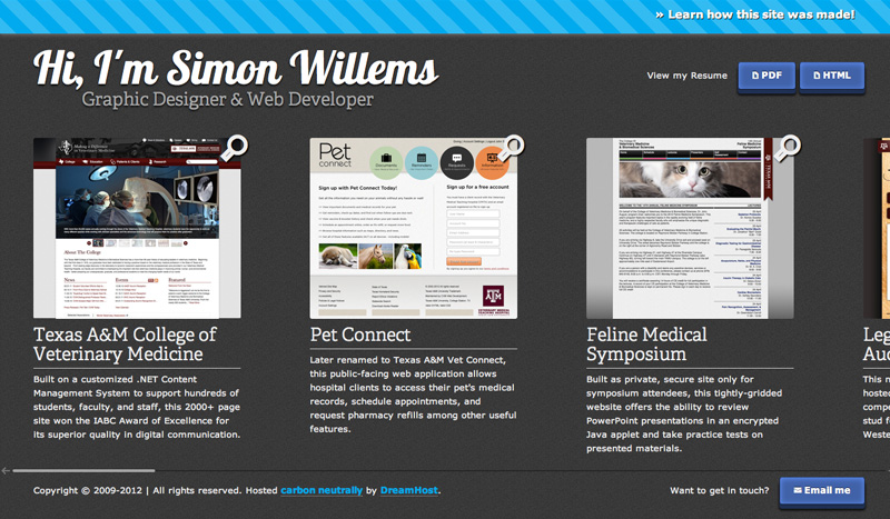
Screenshot of what this site looks like in a modern browser
Good web standards also means good accessibility. Site's should be completely functional to the visually impaired. For this reason, I strongly support Section 508 of the American Disabilities Act and practice the very best web standards I can.
Learn More
- Modernizr
- JQuery
- Understanding Progressive Enhancement
- Web Standards Checklist
- Introduction to Web Accessibility
Security
While divulging the specifics of this site's security mechanisms would be foolish, I will say that I treat the subject very carefully. Protecting against common invasion techniques such as SQL injection is extremely important. Developing techniques to guard against such threats as well as minor nuisances like spam is part of the modern web developer's performance expectations. Ask me more in person and I might share a trick or two. Maybe...
Learn More
SEO
I can't think of a more divisive topic in the web community than that of the legitimacy of Search Engine Optimization. I fall into the camp that states that websites are made for people, not machines and therefore should be built with that priority in mind. I was able to dramatically improve the search engine ranking of many, many sites just by simplifying code to be more readable (cut out the divitis!), creating descriptive meta content, making title tags and h1's match, and having the first p tag be the most informative part of the page. Seems really simple and that's because it is. Don't fall into the trap of using fancy SEO tricks and schemes. Good SEO is obvious. Period.
Learn More
HTML5 & CSS3
There has never been a more exciting time to be a part of the web. This site is fully tricked out with new HTML5 semantic tags (footer, header, section, etc.) as well as CSS3 transitions and graphics. In fact, apart from the screenshots in the portfolio section, this site contains NO images. How is that possible? Using new CSS3 properties, data URIs, SVG, and pictographic typefaces via @font-face. The best part? This means this site is infinitely scalable, so no more worrying about the high pixel density display arms race - everything is essentially vectorized! future-proof design is the best kind of design. Not having to fret about the next technological wunderkind is a great feeling. When your site works on any device without having to create entirely specialized, separate versions (e.g. a mobile site), you get more time to pour into polish and UX instead.
Learn More
Responsive Design
Grab a corner of this site and resize it at any time. You will probably notice that not only does it load in a new stylesheet to optimize the viewport for multiple resolutions, but it also completely changes it's color scheme. Thanks to the advances in @media queries and a better understanding of fluid grids, this is easily possible. By avoiding UA agent sniffing and other less-than-reliable techniques, this site can be simultaneously optimized from the mobile smartphone to the tablet to the desktop!
Learn More
Touch vs. Mouse
Since the goal in most web design is to reach the largest possible audience while having your content function properly no matter how it is being accessed, it is important to make the site as platform agnostic as possible. Optimizing for touch and leaving mouse users in the cold, or vice versa, is simply untenable which is why this site works for both. Swipe or scroll, it's your choice - not the web's. This debate often breaks down into native application versus web apps for specialized devices like smartphones and tablets. I say why not both? You can have a fancy native app AND still have your website function for those specialized users, regardless.
“Design is the art of gradually applying constraints until only one solution remains”